
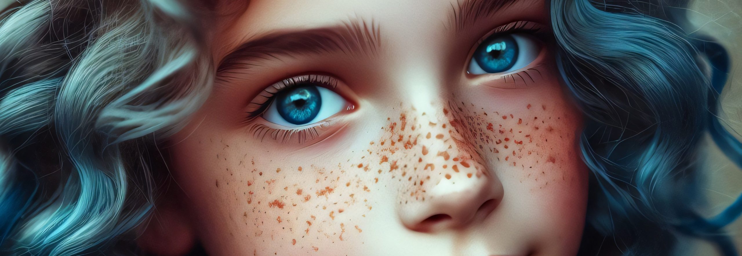
Human skin is one of the most challenging and rewarding subjects in coloured pencil art. Unlike flat surfaces, skin has complex undertones, shifting hues, subtle highlights, and fine textures like pores, freckles, and wrinkles. Mastering it demands not only technical control but also an understanding of colour theory, layering, and blending techniques.
This guide will walk you through everything you need to know to shade, blend, and perfect human skin tones with coloured pencils, from choosing the right colours to creating lifelike textures.
1. Understanding the Complexity of Human Skin Tones
Skin is never a single colour. Even within one person’s face, you’ll find a variety of subtle shifts:
Undertones: These give skin its fundamental warmth or coolness (pink, yellow, olive, neutral).
Surface colour: Varies depending on blood flow (e.g., rosiness in cheeks), environmental lighting, and local variations like shadows or highlights.
Reflected colour: Surrounding objects can tint the skin — a green shirt may cast a faint green onto the lower face.
Study real-life references or high-quality photos, and always identify the dominant undertone before starting. This will inform every colour choice you make.
2. Choosing Your Coloured Pencils
Professional-grade pencils like Faber-Castell Polychromos, Caran d’Ache Luminance, or Prismacolor Premier are essential for their rich pigmentation and ability to blend smoothly. Key colours for realistic skin tones often include:
Warm tones: Burnt Sienna, Venetian Red, Terracotta, Peach.
Cool tones: Light Pink, Rose, Cool Grey, Lavender.
Neutrals: Cream, Beige, White, various Earth tones.
Deep values: Dark Umber, Sepia, Black for shadows.
Highlights: White or a Colourless Blender for smooth transitions.
3. Preparing Your Surface
The paper’s texture (tooth) dramatically affects how many layers you can build. Professional artists often prefer:
Hot-pressed watercolor paper (smooth, less texture) for subtle blending.
Bristol Smooth or Vellum for a balance of layering and detail.
Sand-colored or toned paper can add warmth and cut down on filling large areas with base colours.
Always tape your paper to a firm board to avoid warping and shifting.
4. Mapping the Values: the Underpainting Stage
Before adding colour, it’s crucial to map out light and shadow. Some artists do this in a monochromatic underpainting (grisaille) with light grey or sepia pencils. Lightly sketch the main facial features, then block in the darkest shadows and brightest highlights.
This value map provides a roadmap for accurate depth and avoids overworking highlights later.
5. Building Layers: the Secret to Lifelike Skin
Coloured pencils rely on gradual layering rather than pressure. Use light, even strokes — almost like dusting the surface — and build up colours slowly. Follow these guidelines:
Base layers: Choose a light version of the skin’s undertone (e.g., Cream, Light Peach, or Light Pink). Use circular motions to avoid harsh lines.
Midtones: Introduce warmer or cooler colours, depending on the area — cheeks might have more pink, forehead more yellow or beige.
Shadows: Layer darker browns, warm greys, or cool purples (for fair skin, avoid black — it can look flat and unnatural).
Highlights: Preserve the white of the paper in bright areas or add white pencil sparingly.
Use cross-hatching or small, overlapping circular strokes to prevent streaks.
6. Blending Techniques for Smooth Skin
Achieving seamless skin requires advanced blending skills. Here’s how:
A) Dry Blending
Lightly layer colours until the tooth of the paper is filled.
Use a white or cream pencil to burnish — applying firm pressure to mix pigments directly on the paper, creating a smooth, painterly look.
Alternatively, a colourless blender pencil can unify layers without shifting colours.
B) Solvent Blending
Odourless mineral spirits (OMS) or isopropyl alcohol can dissolve the binder in wax/oil-based pencils, smoothing colours beautifully.
Apply solvent sparingly with a soft brush or cotton swab, using small circular motions.
Let it dry completely before adding more layers; too much solvent can damage paper.
C) Layered Blending
Rather than relying on burnishing or solvents, professionals often blend by layering dozens of light applications.
This preserves more subtle transitions and gives you better control.
Pro tip: Always start with lighter colours and build to darker ones; it’s easier to deepen shadows than to lighten overworked areas.
7. Creating Realistic Skin Textures
Perfectly smooth skin looks unnatural. Real skin has pores, fine lines, and subtle imperfections. Reproduce these details thoughtfully:
Pores and texture: After building your base, use a kneaded eraser or electric eraser to lift tiny dots of pigment in highlight areas. Add back tiny specks with a sharp pencil.
Freckles and moles: Dot lightly with a sharp pencil — vary size and placement for realism.
Wrinkles: Use sharp, thin lines for creases, blending gently at the edges so they sink into the skin rather than looking drawn on.
Peach fuzz: For soft facial hair, lightly flick a very sharp white or pale pencil in the direction of hair growth.
Avoid overdoing textures — subtlety is key.
8. Adjusting Hues for Different Ethnicities and Skin Tones
Skin comes in a stunning range of hues, and accurate representation requires sensitivity and observation. Here’s a simplified approach:
Light skin: Base layers in ivory or peach, midtones in rose or light ochre, shadows with cool greys or muted purples.
Medium/olive skin: Base layers in yellow ochre or raw sienna, midtones in warm browns, shadows in deep reds or greens (olive skin reflects green undertones).
Dark skin: Base layers in burnt umber or walnut brown, midtones in reddish browns, shadows in deep blues, purples, or black. Highlights can be rendered with subtle warm or cool greys rather than white.
Always match your palette to your reference rather than assumptions about “standard” colours.
9. Lighting: the Game-Changer
The direction, intensity, and colour of your light source can dramatically alter skin tones:
Warm light (sunset, indoor bulbs) adds gold and orange hues.
Cool light (cloudy day, fluorescent) brings out pinks, purples, and blues.
Multiple light sources create complex colour shifts and overlapping shadows.
Plan your light source early and keep it consistent across all facial features. When shading, remember:
Shadows are rarely pure black.
Highlights reflect the light’s colour.
Transition areas (midtones) are where skin’s subtle variations shine.
10. Refining Edges and Details
Once your main shading is complete:
Use a sharp pencil to crisply define the edges of the nostrils, eyelids, lips, and jawline. Avoid outlining with black; instead, use a dark version of the local colour.
Add fine details like pores, veins, or subtle colour variations (e.g., a faint blue for veins near temples).
Step back regularly — it’s easy to overwork small areas. Viewing your piece from a distance helps you see overall balance.
11. Fixative and Protection
Coloured pencil works can smudge, especially heavily burnished areas. Lightly spray your finished piece with a fixative designed for coloured pencils or pastels to protect it.
Always test fixative on a scrap piece of the same paper, as some brands can dull or alter colours.
12. Practice and Observation
Real mastery comes with experience. Study faces under different lighting, practise rendering diverse skin tones, and experiment with layering orders. Keep a swatch book of colour blends — this saves time when planning future portraits.
Final Thoughts
Achieving perfect human skin tones with coloured pencils is a balance of technical skill, patience, and an eye for subtlety. By building thin, layered applications, respecting undertones, blending thoughtfully, and adding realistic textures, you can create portraits that glow with life and authenticity.