How to Choose Reference Photos for Pencil Portraits
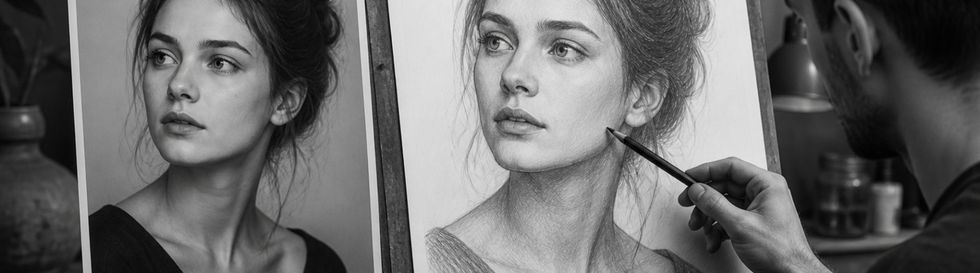
Even the best pencil technique cannot rescue a poor reference photo. This guide explains how to choose reference photos for pencil portraits — covering lighting, resolution, pose, expression and common pitfalls when working from client snapshots.
1) Lighting Quality
Natural window light or soft studio lighting reveals form best. Avoid harsh on-camera flash that flattens features and blows out highlights. Side lighting adds depth ideal for graphite shading.
2) Resolution and Focus
Eyes must be sharp. If the source image is blurry or heavily compressed, fine detail in lashes, iris and skin texture becomes impossible to recover in the drawing.
3) Pose and Composition
Simple three-quarter or front poses translate well to portraits. Extreme wide-angle selfies distort noses and chins — request an alternative angle when possible.
4) Expression and Likeness
Choose an expression the subject recognises as natural. For commissions, confirm the selected photo with the client before starting the drawing.
5) Practical Checklist
– Eyes in focus?
– Even, directional light?
– Sufficient resolution for print size?
– Natural expression?
– Minimal filters or over-editing?
6) Conclusion
Choosing reference photos for pencil portraits is the first creative decision in every commission. Strong references save hours and produce drawings clients treasure.