
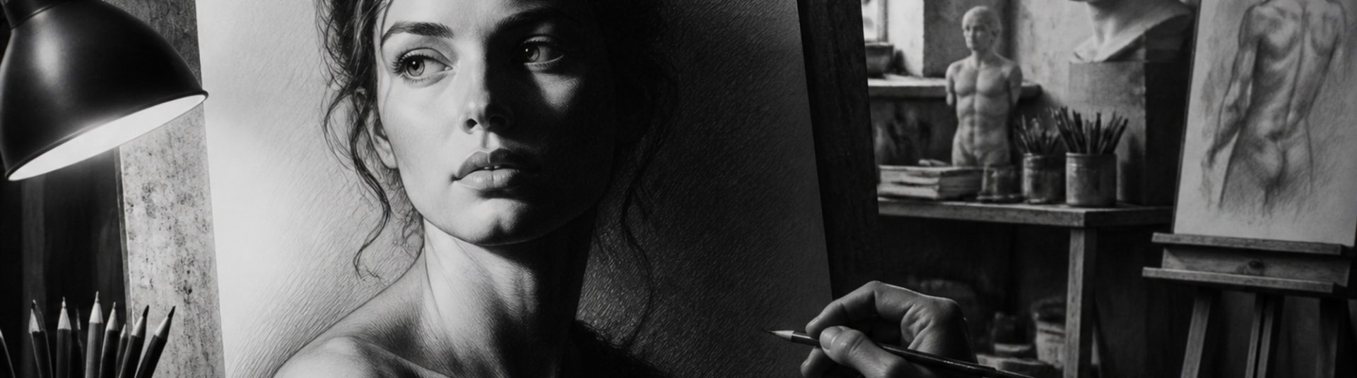
How to Create Depth and Contrast in Pencil Drawings
Depth and contrast separate flat sketches from professional pencil drawings. Whether you draw portraits, pets or figures, controlling value range helps forms turn in space and guides the viewer’s eye. This tutorial explains contrast in pencil drawing for artists who want stronger, more dramatic results.
1) Understanding Value and Contrast
Value is how light or dark a tone appears. Contrast is the difference between those tones. High contrast creates drama; low contrast feels soft and distant.
2) Plan Your Light Source
Single-source lighting simplifies shadows. Decide highlight, midtone and shadow areas before detailed rendering — especially in portrait pencil drawings.
3) Build a Value Scale
Practise a strip from white to black using your pencil set. Know which pencil produces which step — this speeds up portrait work.
4) Layering for Depth
Layer 1: Light global shadow shapes.
Layer 2: Midtones following form.
Layer 3: Core shadows and accents.
Layer 4: Highlights lifted with eraser.
5) Atmospheric Depth
In compositions with background, reduce contrast and detail behind the subject. Sharp edges and strong contrast bring the focal point forward — essential for commission portraits.
6) Edge Control
Hard edges advance; soft edges recede. Use lost-and-found edges on hair, clothing and backgrounds to increase depth without overworking.
7) Common Contrast Mistakes
– Midtone-only drawings with no true darks.
– Black everywhere flattening form.
– Inconsistent light direction.
– Over-highlighting that removes roundness.
8) Conclusion
Creating depth and contrast in pencil drawings is a skill that improves every subject you tackle — from eyes and hair to drapery and pet fur. Study strong lighting, push your darks confidently, and protect your highlights. Your portrait drawings will gain immediacy and professional presence.